
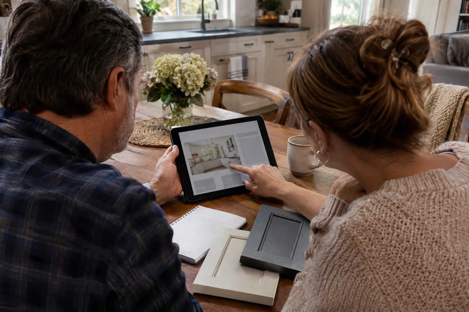
A tablet often sits between the devices included in a website review. It is larger than a phone, smaller than a desktop, and frequently used with touch. Treating it as an afterthought can leave a gap in an otherwise polished customer experience.
Reconstructed archive: November 2012. Written in November 2026 using contemporary historical sources. The archive date organizes this series; this text is not a recovered original.
The November 2012 discussion
Google published tablet-focused website guidance on November 12, 2012. It warned against automatically treating tablets as smartphones and encouraged testing responsive sites across tablet sizes. The discussion reflected the need to consider what visitors could actually read and use on the device in front of them.
Review a real purchase decision
Imagine someone comparing remodeling companies on a tablet at the kitchen table. They want to review project photographs, read about the process, and share a page with a partner. A layout that hides useful details behind tiny hover menus can interrupt that research. Touch users need clear, dependable ways to reveal and navigate information.
Rotate the device during the task
A gallery that works in portrait may crop essential details in landscape. A form may fit one orientation but place its button outside an awkward fixed-height box in another. Check the service page, gallery, and contact route in both orientations. Do not stop after confirming that the homepage appears on the screen.
Make forms comfortable to complete
Labels should remain visible while someone types. Error messages should identify the relevant field in plain language. A large on-screen keyboard changes the available space, so check whether instructions and navigation remain reachable. Ask only for information the business needs to start a useful conversation.
Preserve the information people are comparing
A smaller screen is not a reason to remove qualifications, service boundaries, or an explanation of the next step. Reorganize the presentation so visitors can find those details. Consistency also helps when someone starts on a tablet and later returns from a phone or desktop.
Keep devices in the acceptance review
Include tablet tasks in redesign sign-off and after substantial template or form changes. The specific hardware described in a 2012 article is historical, but the review method remains useful: test how customers make decisions rather than assuming that a layout looks correct because it passed two screen-size checks.
Discuss your website and customer journey or search visibility with Guardian Solutions.
Historical source: Google announcement dated 2012-11-12.