
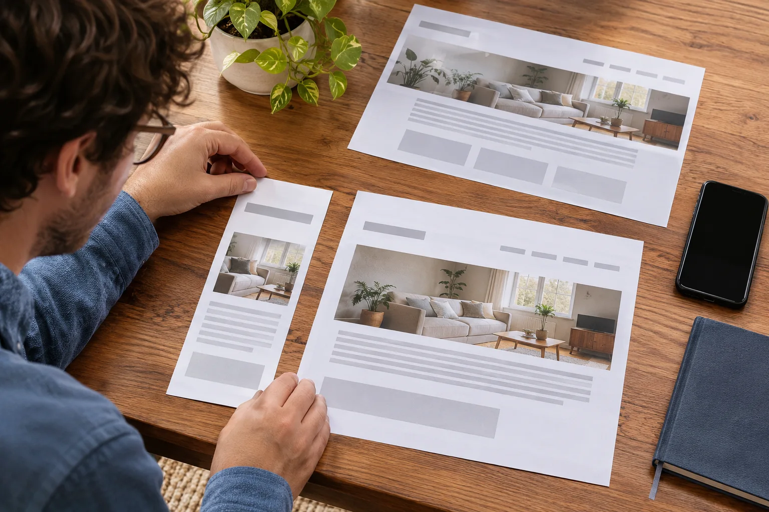
Combining separate mobile and desktop websites can simplify maintenance, but the old mobile addresses still matter. Customers, search results, and saved links may continue to use them. Plan where each important address will lead before retiring the separate version.
Reconstructed archive: September 2017. Written in November 2026 using contemporary historical sources. The archive date organizes this series; this text is not a recovered original.
The September 2017 guidance
Google published guidance for moving from separate mobile URLs to responsive design on September 14, 2017. It emphasized individual redirects to the corresponding responsive pages and reviewing old mobile-specific configuration. The advice distinguished that situation from dynamic serving, where separate mobile URLs may not exist.
Inventory both sets of destinations
Record important desktop and mobile addresses and compare their content. Identify information that exists in only one version. A new responsive template should not accidentally discard useful service details, project examples, or contact instructions simply because they were stored differently.
Map each move to a relevant page
A mobile service page should lead to the matching service information, not automatically to the homepage. Review the mapping with someone who understands the business. Keep the register available for implementation and later troubleshooting.
Review the old configuration
Have the developer examine rules and annotations that existed specifically to support the separate mobile setup. Remove or adjust them as appropriate to the new implementation. Avoid retaining contradictory behavior merely because the visible design appears correct.
Verify real old links after launch
Open representative mobile addresses directly and follow the resulting customer journey. Check the final content and contact route, then monitor relevant issues over time. The historical lesson is to treat responsive migration as a controlled transfer of destinations and information, rather than only a change in screen layout.
Explore website design, digital marketing strategy, or contact Guardian Solutions to discuss your next step.
Historical source: Google announcement dated 2017-09-14.