
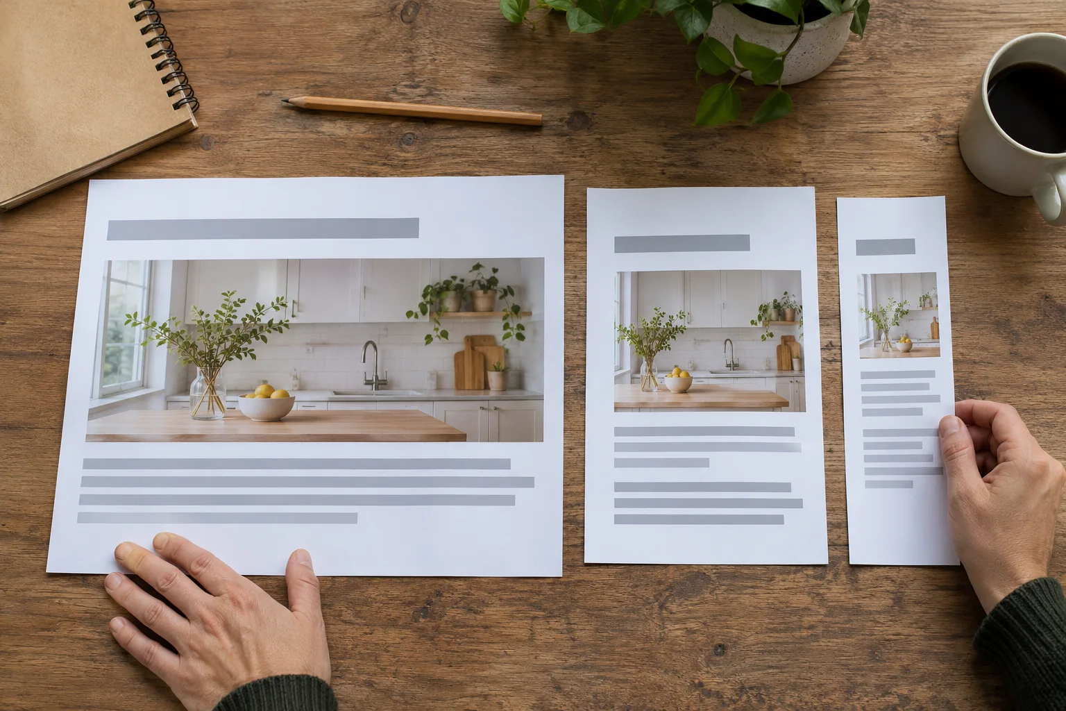
Your customer may start researching on a desktop and call you later from a phone. Those visits should feel like parts of the same journey. A responsive website adjusts the layout while keeping the information and next steps recognizable.
Reconstructed archive: May 2012. Written in November 2026 using contemporary historical sources. The archive date organizes this series; this text is not a recovered original.
Why responsive design mattered in May 2012
On May 1, 2012, Google described how its teams used flexible layouts and media queries to adapt websites to different screens. Maintaining shared pages reduced the need for separate mobile destinations. This was a practical response to growing mobile use, not simply a fashionable visual treatment.
Keep the service information, change its presentation
For a remodeling company, a desktop page might place project photographs beside a description. On a phone, those sections can stack. The visitor should still find the project scope, the service area, and the estimate request. Removing important information to make a narrow screen look tidy can leave a mobile customer unable to make a decision.
Test a task instead of admiring a screenshot
Open a service page on a phone. Read the description without zooming, open the navigation, and reach the relevant contact form. Check that the keyboard does not cover instructions and that a validation message explains what needs correction. Then repeat the task with a larger text setting. A layout that looks balanced at one font size may fail when a customer increases it.
Watch the spaces between familiar screen sizes
A page can work on a large monitor and a small phone yet become awkward on a tablet. Look for headings that collide with photographs, narrow columns, and fixed-width elements that force horizontal scrolling. Ask the developer to fix the layout behavior rather than hiding the problem at a single test width.
Decide what deserves the first screen
A compact layout still needs a clear introduction. Lead with the service and the customer problem. Keep secondary promotions and decorative elements from burying the action someone came to complete. The phone number should be readable and usable, but it should not replace the supporting information a customer needs before calling.
A maintenance decision with lasting value
The tools have evolved since 2012, but the business requirement has remained consistent: customers should not lose useful information because they change devices. When commissioning a redesign, make successful customer tasks part of the acceptance review, alongside the visual design.
Discuss your website and customer journey or search visibility with Guardian Solutions.
Historical source: Google announcement dated 2012-05-01.